

The challenge and the solution
Capitale needed to position itself as a financial management brand capable of conveying clarity, security, and growth, without falling into the generic aesthetics of fintechs or overly impersonal systems. The challenge was to build an identity that connected technology and trust , but with a visual language accessible to small and medium-sized enterprises.
The solution was to develop a visual ecosystem that combined institutional solidity, simple readability, and a contemporary presence . Everything was designed to make the brand appear organized, trustworthy, and prepared to support the client's growth, from their first contact with the brand to their experience with the product.

The Capitale symbol is based on the shape of a column, a choice made to visually translate the brand's role within its clients' financial operations. Historically, the column represents support, structure, permanence, and trust; it is the element that supports, organizes, and provides a secure foundation for something larger to exist .
This concept reflects the brand's role: to organize financial operations and provide structure for the company to grow with greater clarity, control, and security. At the same time, the simplified and geometric form connects this meaning to a more technological, contemporary, and functional world. The result is a symbol that unites institutional strength and practical efficiency, positioning Capitale as the cornerstone of its clients' financial management.


The brand's signature was designed to reinforce this same balance . The logo features a clean, robust, and direct typographic construction, without excesses, to communicate a company that simplifies a complex theme. The relationship between symbol and name was designed to function clearly in different contexts: from the product interface to the brand's physical applications. More than just identifying the company, the logo needed to reinforce the perception that Capitale is a serious, organized platform prepared to support important decisions .

The color palette was designed to support three pillars of the brand: growth, confidence, and sophistication.
The primary green represents evolution, movement, and financial health , a coherent choice for a company that helps businesses grow with more control. The darker shade serves as an institutional base , bringing depth, stability, and contrast. The light gray balances the composition, resulting in a cleaner and more mature communication.
Graphic arts
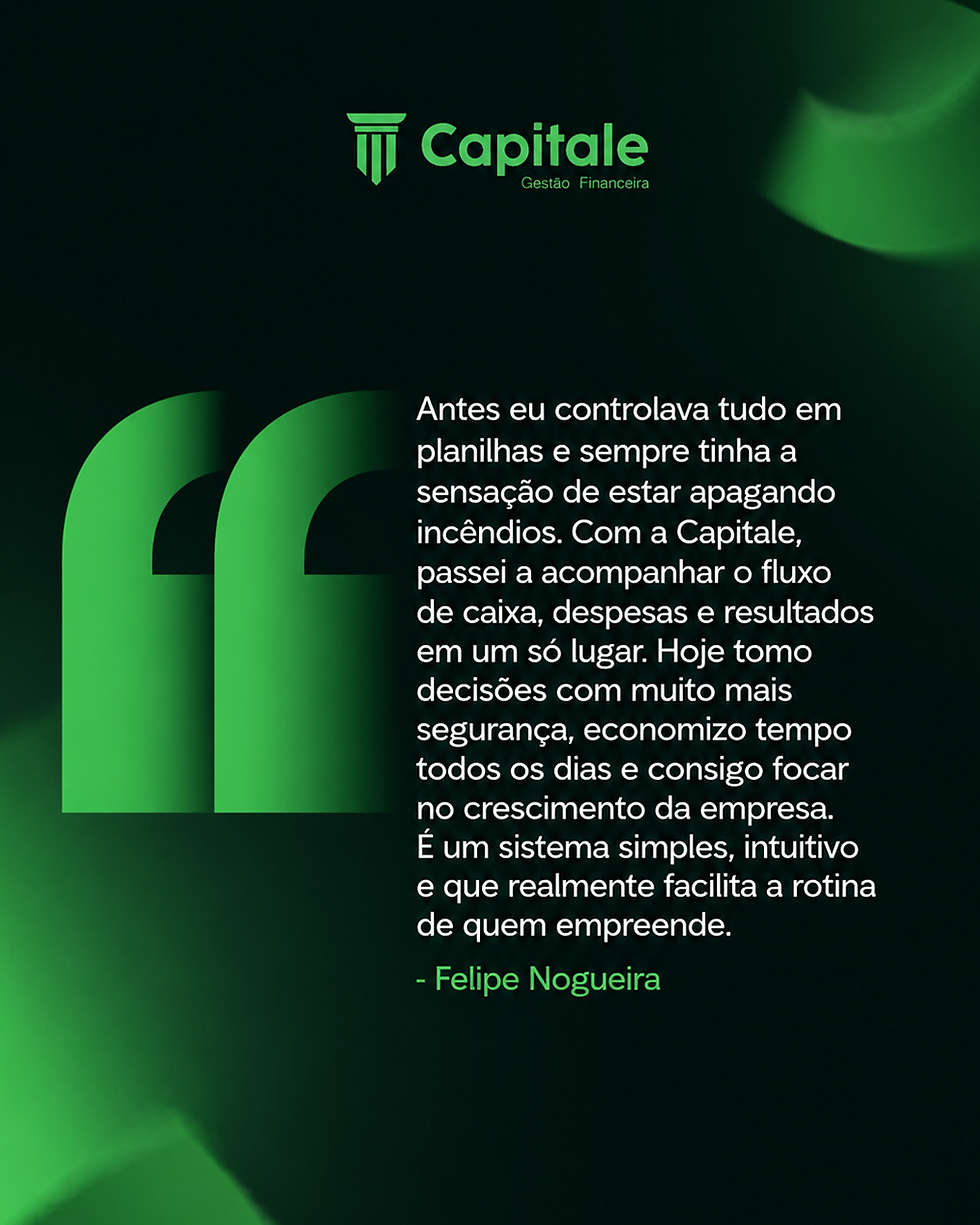
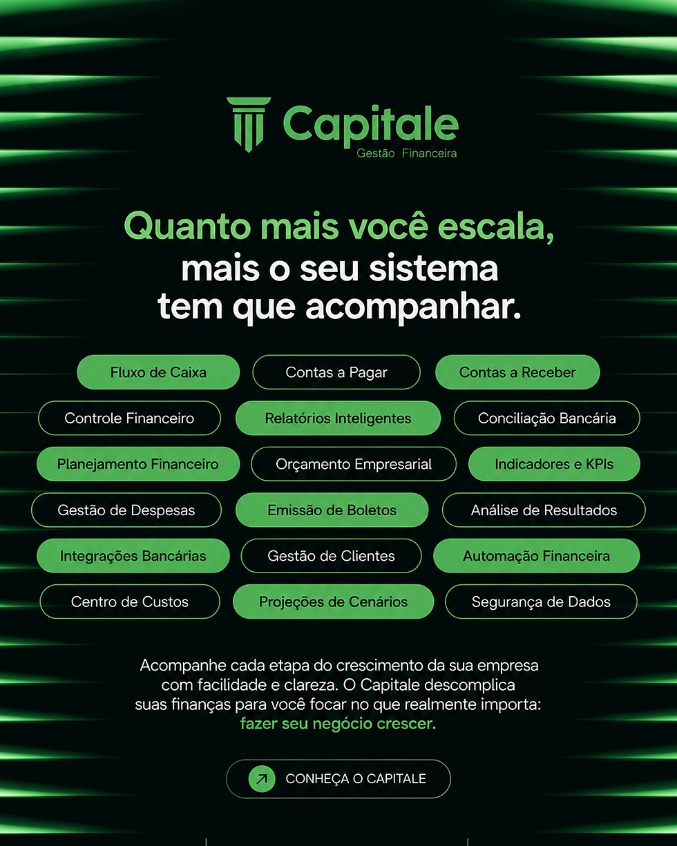
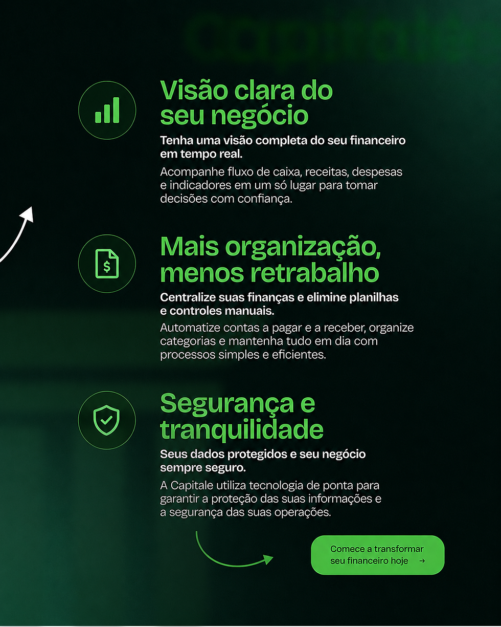
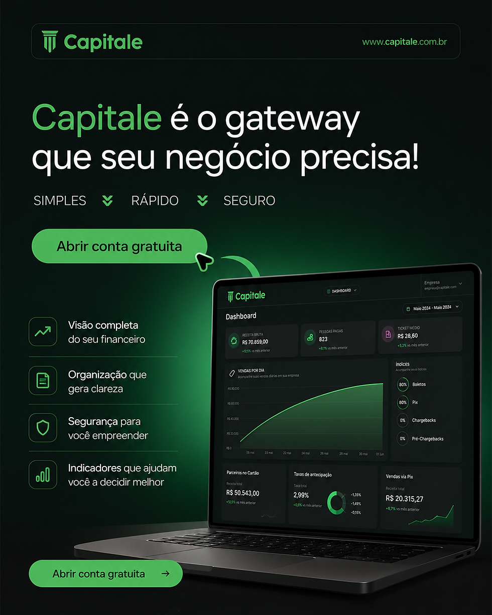
The graphic elements were designed to translate the brand's positioning into communication . The visual direction followed a cleaner line, with strong contrast, objective typography, and compositions that emphasize the message without excessive elements.
The logic behind the artwork has always been the same: to show that Capitale doesn't sell complexity, it sells vision, control, and fluidity . Therefore, the layouts explore breathing room, clear hierarchy, and visual elements that reinforce organization and technology without seeming generic or artificial.
Each piece of artwork was designed to strengthen brand consistency and create a visual repertoire capable of working both on social media and in presentations and institutional materials .
Mockups
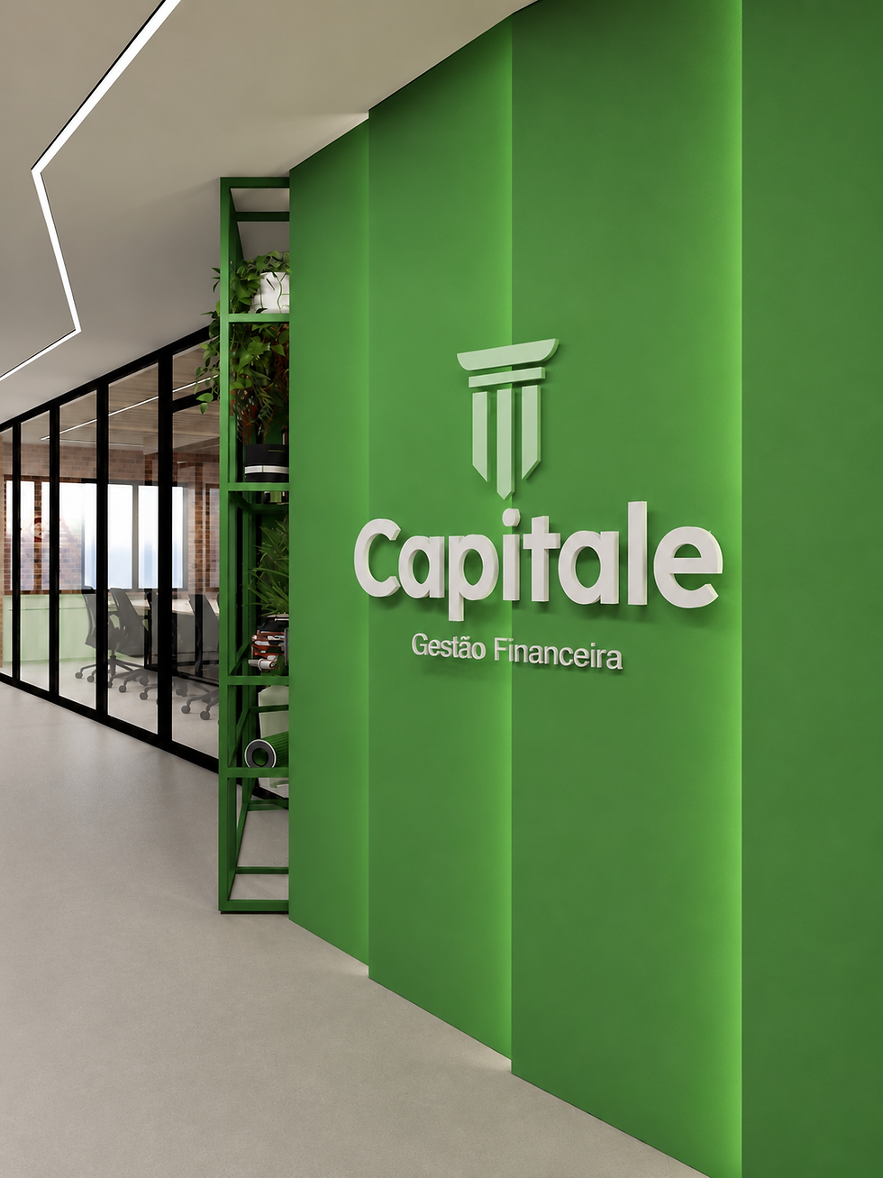
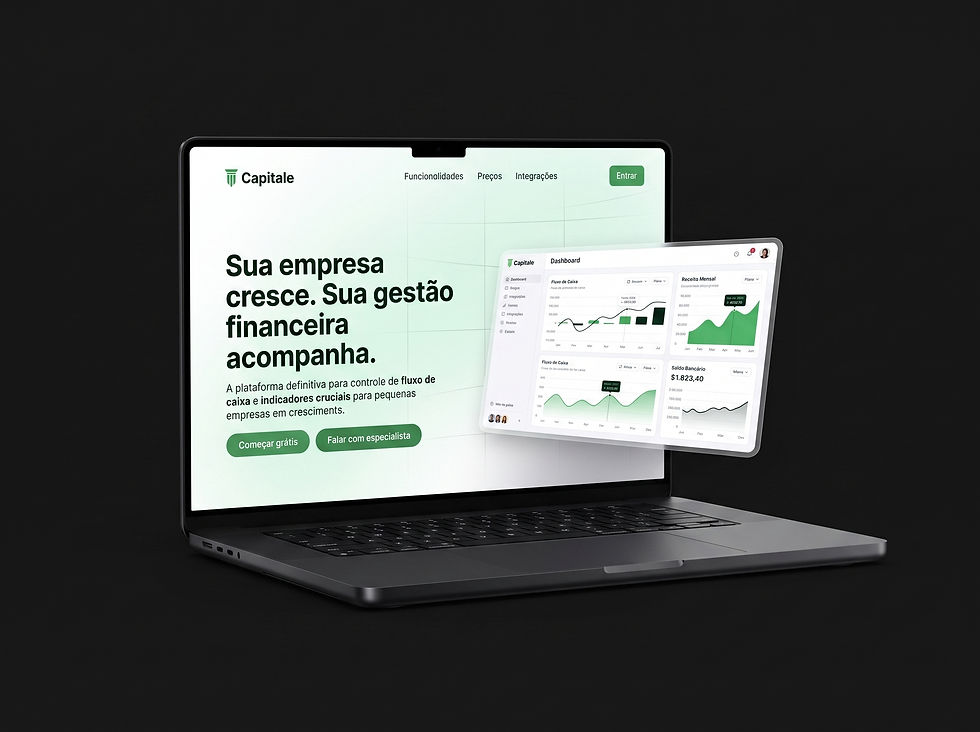
Mockups played an important role in the project because they helped transform the identity into concrete perception . Instead of presenting the brand only in an abstract way, the applications showed how it behaves in real contexts: corporate environment, physical materials, interfaces, and customer touchpoints.
This helped to scale and lend credibility to the project, showcasing Capitale as a brand ready to exist in the real world, and not just as a visual exercise. Furthermore, the mockups reinforced the brand's tone: professional, contemporary, and connected to the world of growing companies.


Onboarding for customers
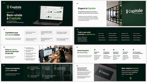
Onboarding was conceived as a strategic extension of the brand identity. It was structured to organize the client's entry into the platform, explain its value, reduce noise, and clearly demonstrate what Capitale solves. The goal was for the client to quickly understand the problem the platform solves, what it centralizes, how implementation works, and what practical gains it can achieve.
The result is a cohesive project from start to finish , where identity, applications, and product presentation work in the same direction to position Capitale with greater clarity, consistency, and brand strength. Each element was built to reinforce the perception of a solid, modern company prepared to support its clients' growth.
View the full gallery and explore all the developments of the Capitale project.


