

Due, the diagnosis
Due Café is positioned in the São Paulo coffee shop market, a competitive landscape marked by a strong presence of large chains and independent establishments with standardized aesthetics and communication. In this context, there is a saturation of brands that prioritize volume, speed, and generic aesthetics, leaving room for more specific and sensory offerings.
Due's distinguishing feature lies in its clear operational focus: operating during evening hours (5 PM to 10 PM) and prioritizing encounters. This approach shifts the brand from the traditional territory of utilitarian consumption (coffee as a routine) to an emotional territory (coffee as a shared experience).

Due's Positioning
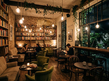
Due Café positions itself as a coffee shop geared towards gatherings , focusing on providing a welcoming and intimate atmosphere in the evening. Its territory lies at the intersection of coffee and emotional experience, where the product is not just the beverage, but the context in which it is consumed.
The Due Café identity stems from the idea that coffee is merely a meeting point, not the main focus. The mug-shaped "D" solves this simply and directly, effortlessly uniting symbol and name. The typography blends stability and intimacy: the firmer forms convey presence, while the handwritten "a" and "e" break the rigidity and create a sense of connection, almost like personal writing. The earthy color palette reinforces this atmosphere, alluding to the warmth of coffee and the more intimate and quiet nighttime environment. Everything converges on the same intention : to create a space that invites you to stay, talk, and live in the moment.


Their palette combines olive green, which conveys warmth and well-being; shades of brown, inspired by wood, coffee beans, and the warm atmosphere of the environment; and off-white, which evokes the softness of porcelain, coffee foam, and cozy lighting. Together, these colors create a sophisticated and intimate visual language, reinforcing the brand's positioning as an urban refuge to slow down , share moments, and transform a simple coffee into a memorable experience, especially during the evening.
.jpeg)

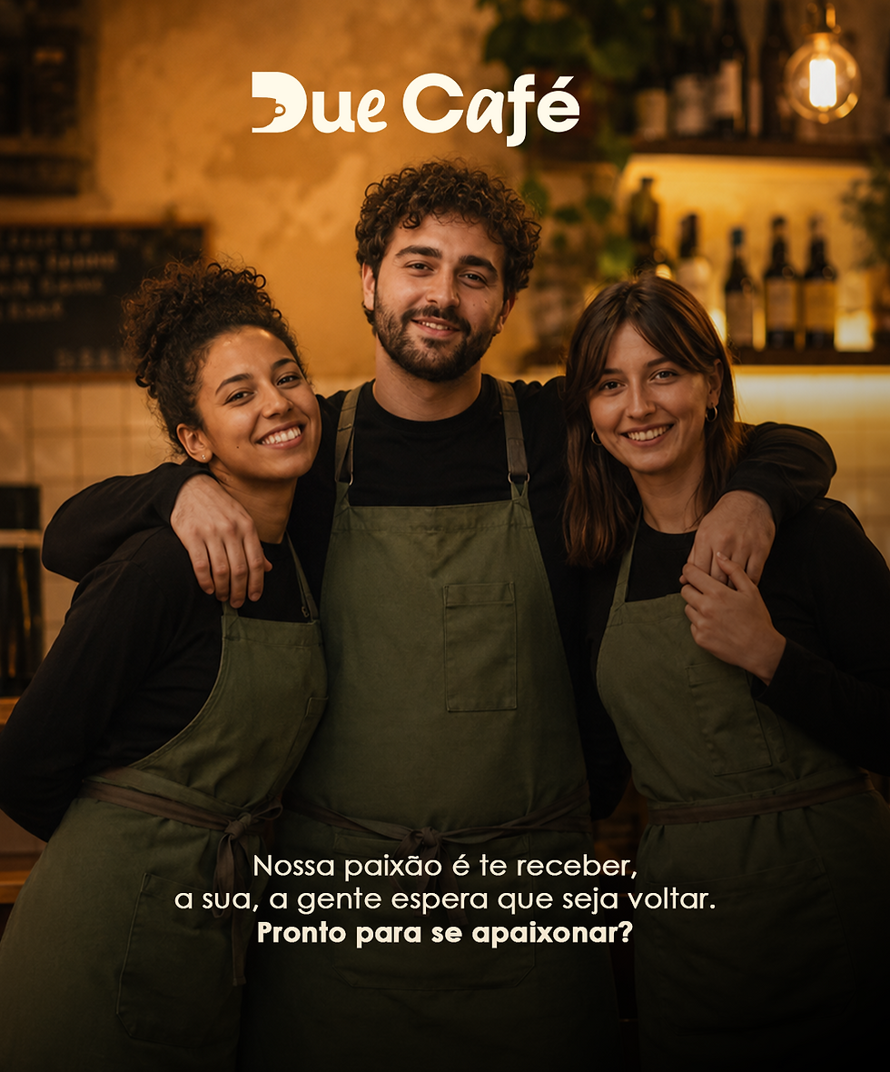


The delivery of 6 posts follows the same logic as the brand: less isolated product and more atmosphere building. The strategy was to create a set that positions the brand. The set functions as a consistent first contact. It doesn't try to convince quickly, but to build perception. The visual repetition, the use of the color palette, and the intimate language create unity and recognition. The result is simple: whoever sees it understands what Due Café offers without needing a direct explanation.
Come and see how the Due Café gallery turned out!


