

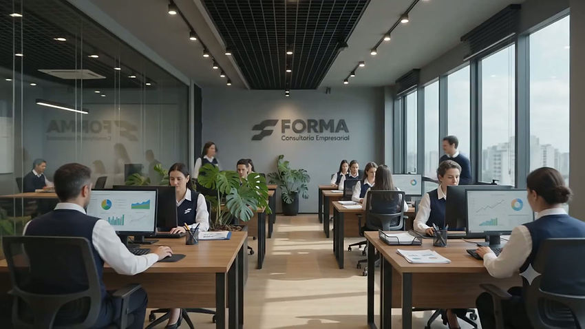
Form, the challenge
Forma came to the studio with a problem that much of the business consulting market never solves: how to communicate technical authority without sounding distant, and how to connect with the people behind each business without losing the rigor that justifies hiring a consultancy . Between the coldness of traditional reports and the motivational tone that dominates the world of coaching, a third path was missing. And it was this path that we guided from scratch, from the positioning strategy to the construction of each visual piece, to give Forma an identity that speaks with clarity, presence, and substance.


The Symbol
We designed the F from a geometric grid of circles, lines, and tangents, with modules of rigorously standardized proportion and thickness . This was not a stylistic decision, but a direct translation of Forma's working method: just as a company's processes, people, and goals only gain strength when precisely organized, each geometric fragment of the symbol only holds up in relation to the others. The result is a symbol that carries, in its very construction, the portrait of the four stages that structure the company's methodology: diagnosis, development, implementation, and evaluation.
The Palette
We chose Prussian blue because of its roots in the world of technical drawing. Ice white acts as a breath of fresh air, ensuring that this structure is clearly read, while lead provides weight and support, like the framework that holds the load of a building. The combination of the three doesn't decorate the brand; rather, it reinforces, color by color, that Forma builds structure before building discourse .

The Commercial Proposal
We built the presentation material to communicate, above all else, measurable results and a replicable method. ROI figures, operational efficiency gains, and growth curves appear alongside the four-step methodology, making it clear that Forma doesn't deliver opinions, but rather a process with a traceable beginning, middle, and end, which completely changes the company's sales conversation with its clients.

The Logo
We sought a sans-serif typeface with a firm stroke precisely to avoid the two extremes the brand needed to avoid: a serif would suggest the cold authority of a traditional office, while a more organic typeface would bring the brand closer to the emotional tone of coaching. The robust weight and condensed construction ensure Forma's immediate presence and clarity , without borrowing the visual vocabulary of either of the two models it exists to overcome.
.png)

Graphic Design for Social Media
We structured Forma's communication so that each publication fulfilled a clear function within the customer journey —educating, addressing a real pain point, connecting through people, or demonstrating results—instead of repeating the same institutional message in different formats. This discipline in content is an extension of the company's own method: just as consulting guides the client from diagnosis to execution, communication guides the audience from the first contact to the decision to close the deal.



The result
What Forma communicates today is a direct consequence of the groundwork laid: an identity built with criteria, applied with discipline in each piece, without improvisation.
Check out the full project gallery below.


